Saturday, 12 May 2012

4. How did you use new media technologies in the construction and research, planning and evaluation stages?

During my project, i used many pieces of new media technologies over many different pieces. Firstly, i created my radio advert for my newspaper. I did this by using a computer wired up to a number of microphones which went through an external mixer, then i would record the sound using audacity.


Once i had recorded the piece, i would save the recording as a .WAV file. Once all of my clips had been recorded, i imported all of the sound files into adobe premier pro. From here i could do a number of things. Firstly, i went through all of the clips to see which were the best. If i though there was 2 separate bits, i could cut and paste them into a different file to make it sound even better.

After this stage it was a matter of just adding final adjustments to it. I did this by adding a song in to make one of the sections more lively and upbeat. I did this by importing the MP3 into Premier Pro. After this i could perfect the timings of all my pieces and then do a final edit and finally export the finished piece.

After this, i started on my main piece. For this i decided to use Microsoft Publisher. The choice was simple as it is the simplest program to pick up on. Compared to a package like Adobe Photoshop, it is extremely easy to use.

 Firstly, i designed my layout of the newspaper. Using publisher, this is very easy as you can tell the package how wide you want each columns, How many columns you would needs, and make a text size and font the default. I could arrange all my text boxes however i wanted to as the program let me drag them anywhere i wanted to.

I can import pictures that i took off the Nikon D60 camera. This was another use of new media technologies as things like when the picture has been taken, the on board screen briedly shows you the photo that you have just taken. You can then choose weather to keep the picture or not.

3. What have you learnt from your audience feedback?

In the media, and everyday life in general, getting to know what the audience think is essential! So this is why people choose to ask the audience for their feedback, as it is them who will be using and paying for the end product. This way i could easily find out what needed changing in my media products, and find out what was actually good in my products. The main ways which i conducted were in surveys and by asking people in person.

This was one of the things that i found interesting during my research was that over half of the people interviewed don't or rarely read newspapers. This is quite sad state to be in. With the internet being as big as it is, and more and more people getting their news from their mobiles. This almost makes it feel almost useless producing a newspaper. Maybe a website, or even an app would be a better way to spread new news.


Wednesday, 29 February 2012

2. How effective is the combination of your main product and ancillary texts?

To keep my newspaper matching and looking professional, i had to keep all of the font, colour scheme and size the same.

When first combining my main product and the ancillary texts i knew that i needed the style of it to keep the same for it to create a good combination. This was done by using the colours in my logo (red, black and white). This created a more professional look as it looked like it was all from the same newspaper which was the effect i was going for. This was for my front cover and the first page of the newspaper. It was vital that they felt that they were from the same brand because if not there would of been no consistency in my piece.

For my other piece (My advert) i have carried on the trend, by having a black background, with white arrows and red text. Then finally i had the logo on the bottom of it to make sure that the reader knew where the advert was from. This added consistency gives a professional feel to the newspaper and gives more brand exposure than if i was to have different colours all the time. This will hopefully allow my readers to connect with the colour scheme.

Also with the advert, i think it describes the newspaper very well. As i am advertising a new paper, the newer generation want their news to be straight to the point, with no waffle. Even though this wasn't my initial idea for my advert, after playing about with a few ideas i thought that this looked the most professional and gave the reader a good idea about what we are all about.

Overall i found that to be successful with my products, i need consistency, powerful messages, good advertisements and a catchy slogan. I think i have achieved all of these within my products as all my products look related through the colour schemes and the use of my logo. The powerful messages being embedded within the stories. Good advertisement through my poster, and my main slogan 'Bringing Manchester Closer' makes the reader feel involved by reading the paper.

1. In what ways does your media product use, develop or challenge forms and conventions of real media products?

Evaluation

Firstly, i analyzed a number of different newspaper logos and looked at the conventions that they generally followed. The real media products had a big influence over my final logo. The one that i choose to base my logo on was the mail on Sunday's. A basic single lined logo which stretches across the full page of the front page.


Another common style of newspaper logo in the local area and throughout the country is the logo that appears to be in a box. Ones like this include The Sun, News of the World and The Metro.
All of the above logos follow the general conventions of a newspaper. With there being 1 or 2 colours throughout the logo and the same throughout the full newspaper. The logos also need big, bold and tell the reader exactly what they are reading. There is no point over complicating the logos as they wont be read as much as the full content inside

With the conventions in mind, i designed my logo in Microsoft publisher. I used red and black as the colour scheme as the red is eye catching and the black nicely contrasts the red. The conventions of my logo could be classed as going against the trend though as i have included the logo as a part of the logo. I felt this was beneficiary as it adds more of a local feel to the newspaper.

The paper above is a Wigan local paper. This follows the general conventions of a newspaper. It has the logo at the top, with adverts everywhere. There is the main article and some pictures to follow up.


For my paper, i decided against having the logo next to an advert and instead have the logo using the full top of the newspaper. I have done this as i think one large advert is more desirable than a few small ones. The little information bar below the heading is also a nice idea i think as it gives the reader a little insight to the newspaper by telling them when it is out. I have tried to keep the front cover just about the main story mainly and just given a little insight to the rest of the paper on the right.

I think my newspaper does follow most of the general conventions of a traditional newspaper, but mine has slightly challenged that by having the slogan embedded into the logo rather than down the page. I have also challenged general conventions as i have included what is featured inside the paper on the right, this is more commonly found in a magazine but is also a good addition to a newspaper.

Another way i have challenged conventions in my first page is that i have included a 'gig guide'. Again this is more suited to a magazine but with it being a local paper, it is showing the locals what is happening in the local area. But at the same time i am still following the general conventions by carrying on my colour scheme of red, white and black. I have used a large picture to draw in the reader, and a large advertisement to replicate that of a real newspaper.

Friday, 25 November 2011

(Other) Radio Advertisements

This is one of the radio adverts i could find. This again shows the sheer lack of interest in radio advertisements. This advert is american as i had lots of trouble finding an english radio advert. American adverts are alot more emphasised.

(Lack of) Radio Advertisements

I have been trying to research radio advertisements in the last few weeks to give me a few ideas for my own project. In this time i have descovered that a newspaper radio advert is very uncommon. Even the tv ads aren't in their bucket fulls either. But there are plently more tv ads than radio ads. I have no idea why this is. Not even local papers seem to advertise on the radio, weather it be through a lack of funding or weather it being just unneeded.

Friday, 18 November 2011

(Poster) Advertisement ideas

For this i have 2 initial ideas. My first idea is to use the slogan "bringing manchester closer", and use an actual picture of manchester and somehow have them all pulling together (coming closer).
My second idea is to just have a simple image of the front cover of my paper, preferably on a tilt, and just simply have the words, "out now" underneath to try and tempt potential customers into buying it.

Thursday, 17 November 2011

Radio advert ideas

My initial idea for the advert will be to have sound clips all joined up, and then in the breaks have "key words" that the paper will contain, eg, Sport, Local News, Weather.
I will be using the college recording studio and using audacity to record the recording, them use adobe premier to do the final edit and add the music.

Tuesday, 15 November 2011

New Front Page Story

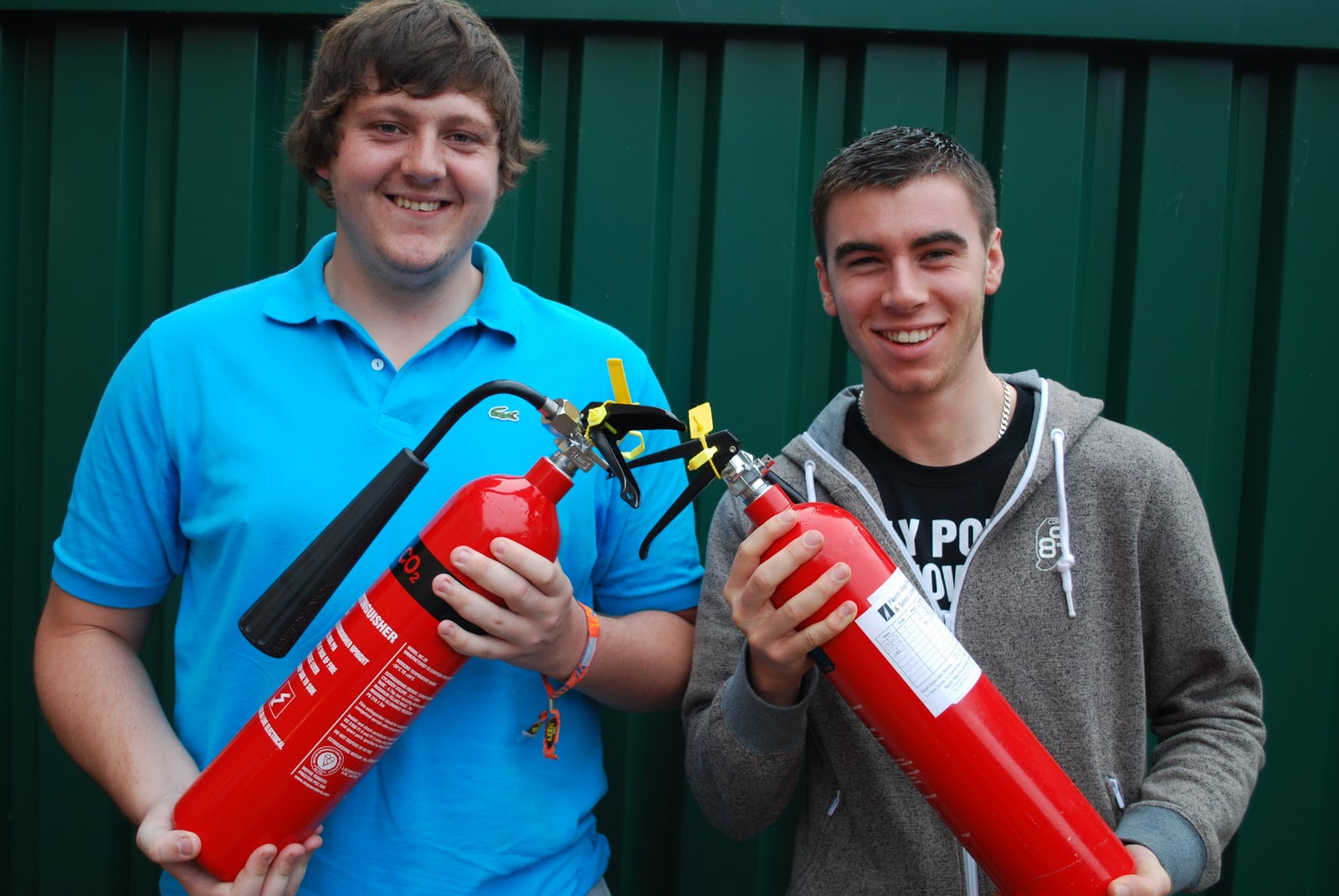
My original idea has been replaced by a newer idea of which 2 warehouse workers save thousands of pounds of equipment be beating off robbers with fire extinguishers. Below is my picture in which i am going to be using for my front cover.

Friday, 4 November 2011

Newspaper Ideas

I have 3 story ideas.
For my front page, i had decided on health inspectors shutting down the college due to health and saftey standards.
For my inside stories i am going to do about a new local DJ, and a local boy winning an eating contest.

Selected Slogan

For my slogan i have chosen "Bringing Manchester Closer". After much thought and consideration, i have decided upon this for my slogan for a few reasons. Firstly, it is very short, this is good as people are more likely to remember something that is short. Secondly, it is quite sharp and snappy. This again will help people remember the name. Finally, it gives the buyer a general idea on where the news is based, as it contains the area which it is based in, Manchester.

Slogans

Today, i am looking into slogans from other newspapers across the globe. There are many including the following;
The Independent newspaper
Advertising slogans:
The quality compact. It is. Are you?

Wall Street Journal
Slogan: The daily diary of the American dream

Helsingin Sanomat newspaper
Marketing slogan: Scandinavia's BIGGEST newspaper

Evening Herald tabloid newspaper, Dublin, Ireland
Advertising slogan: Evening Herald. The Best Part of the Day

Daily Times newspaper, Lahore, Pakistan
Slogan: Your right to know. A new voice for a new Pakistan.

Scotland On Sunday, broadsheet newspaper
Tagline: Scotland up close.

The Sun, a British tabloid newspaper
Tagline: The Sun. We love it!


The similarity in all of these slogans is that they are all short and snappy. I believe that if i want to make a successful slogan it also need to be short, snappy but also memorable. If i can make it these three things then i think that it will make my radio advert sound better, but also it will improve my poster as it will become more memorable.

Tuesday, 18 October 2011

Newspaper TV adverts

I have been researching newspapers for the past few weeks and have been looking at advertisements. There isn't actually that many, but i have found a few TV adverts online. The common trend in these adverts is that it doesn't actually advertise the newspaper, but more what is available through the newspaper (eg, The Sun holidays and free DVDs). This could be because of the "online" generation now wish to access news through other forms rather than the actual newspapers, but rather online or on a mobile phone. Here are 2 examples of TV adverts from the sun.

Sales figures for Regional Newspapers

The table below shows the recent trend in newspaper figures. The second column is the average distribution figure. And the last column is the percentage in which the paper has increased or decreased. This shows that the current trend in people buying the local papers are decreasing everywhere, and not just in more local areas like Wigan, but even the bigger city's like Manchester and Liverpool


Wigan Evening Post
7,092
-6.3pc
Lancashire Telegraph
23,260
-8.5pc
The Gazette, Blackpool
22,074
-8.9pc
Manchester Evening News
90,973
-5.9pc
Liverpool Echo
85,463
-4.1pc
Liverpool Daily Post
8,217
-2.1pc
Newcastle Evening Chronicle
52,486
-8.1pc
The Bolton News
21,940
-9.2pc

Friday, 7 October 2011

Wednesday, 5 October 2011

Newspaper Headlines Ideas

This is my first copy of my potential headlines. With my paper being a local paper, it is always based upon local stories and crysis'.

Front Cover Analysis

Below I have posted 3 newspaper front covers the I have analysised. There are 2 local papers (Wigan Observer and Metro) and a National paper (Daily Mail). The most common thing throughout the 3 papers is that they all have a very simple design, even more so on the local papers. The local papers both contain some sort of advertisement, even though the metro is only a competition, it still advertises. Whereas the Daily Mail can just advertise based upon the stories on the front cover.